In this tutorial, we going to build how to build dynamic form fields using React JS or its framework Next JS. For designing, we are going to use TailwindCSS. So let’s get’s started.
How to create the Next JS app and configure Tailwind CSS
First, we are going to create the next js app. And then configure TailwindCSS to design our interface. TailwindCSS is an inline CSS framework and easy to use. Here is the TailwindCSS Nextjs framework setup to follow.
Get the source code in Github.
//create next app
npx create-next-app@latest my-project
cd my-project

//Set tailwind css
npm install -D tailwindcss postcss autoprefixer
npx tailwindcss init -p
Configure your tailwind.config.js
/** @type {import('tailwindcss').Config} */
module.exports = {
  content: [
    "./app/**/*.{js,ts,jsx,tsx}",
    "./pages/**/*.{js,ts,jsx,tsx}",
    "./components/**/*.{js,ts,jsx,tsx}",

    // Or if using `src` directory:
    "./src/**/*.{js,ts,jsx,tsx}",
  ],
  theme: {
    extend: {},
  },
  plugins: [],
}
Add the @tailwind directives for each Tailwind’s layers to your globals.css file.
@tailwind base;
@tailwind components;
@tailwind utilities;
Setup Tailwind Utitlity Classes to minimize the inline styles
Create a ‘utils’ directory in the root file. and then create a styles.js and paste the bellow code.
export const Styles = {
  addButton: "bg-sky-600 text-2xl px-6 py-1 text-white rounded-md",
  resetButton: "bg-red-600 text-2xl px-6 py-1 text-white rounded-md",
  formLable: "block text-gray-700 text-sm font-bold mb-2",
  formInput:
    "shadow appearance-none border rounded w-full py-2 px-2 text-gray-700 leading-tight focus:outline-none focus:shadow-outline",
};
How to use React Icons?
To use react-icons we need to install the react-icons npm package.
npm install react-iconsLearn More about the React useState hooks.
Create a form components
In a root directory create a folder called components. Inside the components, folder create another folder called “Forms” and create a file FormItem.js. And paste the below code.
import { Styles } from "@/utils/styles";
import React from "react";
import { MdDelete } from "react-icons/md";
const FormItem = ({ item, index, removeForm, inputChange }) => {
  return (
    <div className="my-4 relative w-full h-auto">
      <div className="grid grid-flow-row grid-cols-3 gap-4">
        <div className="w-full">
          <label className={Styles.formLable}>Full Name</label>
          <input
            type="text"
            name="fullName"
            value={item.fulName}
            className={Styles.formInput}
            onChange={(e) => inputChange(e, index)}
            placeholder="Full Name"
          />
        </div>
        <div className="w-full">
          <label className={Styles.formLable}>Passport Number</label>
          <input
            type="text"
            name="passportNumber"
            value={item.passportNumber}
            className={Styles.formInput}
            onChange={(e) => inputChange(e, index)}
            placeholder="Passport Number"
          />
        </div>
        <div className="w-full">
          <label className={Styles.formLable}>Country Name</label>
          <input
            type="text"
            name="countryName"
            value={item.countryName}
            className={Styles.formInput}
            onChange={(e) => inputChange(e, index)}
            placeholder="Country Name"
          />
        </div>
      </div>
      {index !== 0 ? (
        <div className="absolute text-4xl -right-10 top-6 text-red-700">
          <button onClick={(e) => removeForm(e, index)}>
            <MdDelete />
          </button>
        </div>
      ) : null}
    </div>
  );
};

export default FormItem;
Add from functionality in index page
In the index.js page, we will implement our form functionality. Go to pages/indexj.js and paste the below code.
import FormItem from "@/components/Forms/FormItem";
import { Styles } from "@/utils/styles";
import Head from "next/head";
import { useState } from "react";
export default function Home() {
let item = { fullName: "", passportNumber: "", countryName: "" };
const [form, setForm] = useState([item]);
//add more form
const addMore = (e) => {
e.preventDefault();
setForm([...form, item]);
};
//rest form
const resetForm = (e) => {
e.preventDefault();
setForm([item]);
};
//remove form
const removeForm = (e, i) => {
e.preventDefault();
let filterForm = form.filter((item, index) => index !== i);
setForm(filterForm);
};
// On input change
const inputChange = (e, i) => {
e.preventDefault();
let data = [...form];
data[i][e.target.name] = e.target.value;
setForm(data);
};
//onsubmit form
const onFormSubmit = (e) => {
e.preventDefault();
alert(JSON.stringify(form));
};
return (
<>
<Head>
<title>Dynamic Form </title>
<meta name="description" content="Build Dynamic Form in NextJS" />
<meta name="viewport" content="width=device-width, initial-scale=1" />
<link rel="icon" href="/favicon.ico" />
</Head>
{/* Navbar */}
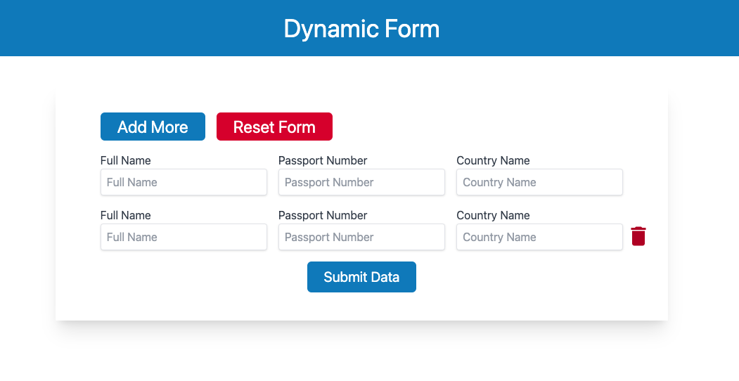
<div className="p-5 text-center bg-sky-600">
<h1 className="text-white text-4xl">Dynamic Form</h1>
</div>
<div className=" w-1/2 mx-auto px-16 py-10 shadow-xl my-10">
<div className="flex gap-4">
<button
className={Styles.addButton}
onClick={addMore}
>
Add More
</button>
<button className={Styles.resetButton} onClick={resetForm}>
Reset Form
</button>
</div>
<form onSubmit={onFormSubmit}>
{form.map((item, index) => (
<FormItem
item={item}
index={index}
key={index}
removeForm={removeForm}
inputChange={inputChange}
/>
))}
<div className="text-center mt-3">
<button
type="submit"
className="bg-sky-600 px-6 py-2 text-white text-xl rounded-md"
>
Submit Data
</button>
</div>
</form>
</div>
</>
);
}
Explaining the functionality
This code defines a React functional component that manages a dynamic form with three fields: fullNamepassportNumber, and countryName. The state of the form is managed using the `useState` hook, which initializes the `form` state with an array containing a single item object, which represents the form data.
The addMore function adds a new item object to the form state when the user clicks on a button, creating a new form that can be filled in.
The resetForm function resets the form state to its initial value, which contains a single item object.
The removeForm function removes a specific item object from the form state when the user clicks on a button to remove it.
The inputChange function updates the form data in response to user input. It takes two parameters, e for the event object and i for the index of the item object in the form state. It creates a copy of the form state array using the spread operator, updates the i-th item object with the new input data, and sets the form state to the new array.
The onFormSubmit function is called when the user submits the form, and it alerts the form data as a JSON string.
Overall, this code provides a basic framework for managing a dynamic form with React and useState, allowing users to add, remove, and update form fields as needed.
