In this post, I will share with you how to design a card using HTML CSS. It’s very easy if you know some basics of HTML and CSS. CSS card hover will help to create this beautiful effect.
CSS Card Hover Effect Video Tutorial
Subscribe to our YouTube Chanel for more tutorials.
People also search for
- Card Design
- Card hover effect CSS
- how to make cards design using HTML CSS
- Card UI design
- Responsive website
- how to make CSS cards
CSS cards design source code
- Create a project folder under any name.
- Inside the project, creates another folder for the image, one index.html, and syle.css file.
- On the image, folder paste your image. Please make sure the image size with 170px×435px for a stunning look.
- Copy the below codes and paste them into your HTML and CSS file.
<html lang="en">
<head>
<meta charset="UTF-8" />
<meta name="viewport" content="width=device-width, initial-scale=1.0" />
<title>Responsive Card Design</title>
<link rel="stylesheet" href="style.css" />
</head>
<body>
<section class="main-section">
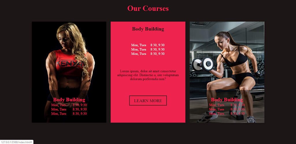
<span>Our Courses</span>
<div class="container">
<div class="item-container">
<div class="item">
<img src="image/item1.jpg" alt="item1" srcset="" />
<div class="info">
<h2>Body Building</h2>
<table>
<tr>
<td>Mon, Tues</td>
<td>8:30, 9:30</td>
</tr>
<tr>
<td>Mon, Tues</td>
<td>8:30, 9:30</td>
</tr>
<tr>
<td>Mon, Tues</td>
<td>8:30, 9:30</td>
</tr>
</table>
</div>
<div class="over-flow">
<h1>Body Building</h1>
<table>
<tr>
<td>Mon, Tues</td>
<td>8:30, 9:30</td>
</tr>
<tr>
<td>Mon, Tues</td>
<td>8:30, 9:30</td>
</tr>
<tr>
<td>Mon, Tues</td>
<td>8:30, 9:30</td>
</tr>
</table>
<div>
<p>
Lorem ipsum, dolor sit amet consectetur adipisicing elit.
Distinctio a, iste voluptatum dolorum perferendis non?
</p>
</div>
<a href="#" class="btn">Learn More</a>
</div>
</div>
</div>
<div class="item-container">
<div class="item">
<img src="image/item2.jpg" alt="item2" srcset="" />
<div class="info">
<h2>Body Building</h2>
<table>
<tr>
<td>Mon, Tues</td>
<td>8:30, 9:30</td>
</tr>
<tr>
<td>Mon, Tues</td>
<td>8:30, 9:30</td>
</tr>
<tr>
<td>Mon, Tues</td>
<td>8:30, 9:30</td>
</tr>
</table>
</div>
<div class="over-flow">
<h1>Body Building</h1>
<table>
<tr>
<td>Mon, Tues</td>
<td>8:30, 9:30</td>
</tr>
<tr>
<td>Mon, Tues</td>
<td>8:30, 9:30</td>
</tr>
<tr>
<td>Mon, Tues</td>
<td>8:30, 9:30</td>
</tr>
</table>
<div>
<p>
Lorem ipsum, dolor sit amet consectetur adipisicing elit.
Distinctio a, iste voluptatum dolorum perferendis non?
</p>
</div>
<a href="#" class="btn">Learn More</a>
</div>
</div>
</div>
<div class="item-container">
<div class="item">
<img src="image/item3.jpg" alt="item3" srcset="" />
<div class="info">
<h2>Body Building</h2>
<table>
<tr>
<td>Mon, Tues</td>
<td>8:30, 9:30</td>
</tr>
<tr>
<td>Mon, Tues</td>
<td>8:30, 9:30</td>
</tr>
<tr>
<td>Mon, Tues</td>
<td>8:30, 9:30</td>
</tr>
</table>
</div>
<div class="over-flow">
<h1>Body Building</h1>
<table>
<tr>
<td>Mon, Tues</td>
<td>8:30, 9:30</td>
</tr>
<tr>
<td>Mon, Tues</td>
<td>8:30, 9:30</td>
</tr>
<tr>
<td>Mon, Tues</td>
<td>8:30, 9:30</td>
</tr>
</table>
<div>
<p>
Lorem ipsum, dolor sit amet consectetur adipisicing elit.
Distinctio a, iste voluptatum dolorum perferendis non?
</p>
</div>
<a href="#" class="btn">Learn More</a>
</div>
</div>
</div>
</div>
</section>
</body>
</html>
CSS Card Design style.css code
/* color background: #1C1815
color primary #ED254E
*/

* {
  margin: 0;
  padding: 0;
  box-sizing: border-box;
}

a {
  text-decoration: none;
}

.main-section {
  background-color: #1c1515;
  position: relative;
  height: 100vh;
  width: 100vw;
  text-align: center;
  padding-top: 20px;
}

.main-section span {
  color: #ed254e;
  font-size: 35px;
  font-weight: 700;
}

.container {
  width: 80%;
  height: 70%;
  position: absolute;
  top: 50%;
  left: 50%;
  transform: translate(-50%, -50%);
  display: flex;
  justify-content: space-between;
}

.item-container {
  width: 100%;
  height: 100%;
  margin: 0 10px;
  display: block;
}

.item {
  width: 100%;
  height: 100%;
  position: relative;
}
.item img {
  width: 100%;
  height: 100%;
}

.info {
  position: absolute;
  color: #ed254e;
  height: 150px;
  width: 100%;
  background-color: rgba(0, 0, 0, 0.5);
  bottom: 0;
  padding: 30px 20px;
}

.info h2 {
  text-align: center;
}
.info table {
  margin: 0 auto;
}

.info table tr td {
  color: #ed254e;
  display: inline-block;
  padding: 0 15px;
}

.item .over-flow {
  content: "";
  position: absolute;
  height: 100%;
  width: 100%;
  top: 0;
  left: 0;
  bottom: 0;
  right: 0;
  padding: 0 30px;
  background-color: #ed254e;
  transform-origin: bottom center;
  z-index: 1;
  text-align: center;
  overflow: hidden;
  transition: all 500ms ease-out;
  transform: scaleY(0);
}

.over-flow h1 {
  margin: 20px 0;
  color: #1c1515;
}

.over-flow table {
  color: #fff;
  margin: 0 auto;
  padding: 30px 0;
}

.over-flow table tr td {
  display: inline-block;
  margin: 0 10px;
}

.over-flow p {
  position: relative;
  padding: 30px 0;
  margin-bottom: 50px;
}

.over-flow a {
  position: relative;
  display: inline;
  margin: 20px 0;
}

.btn {
  position: relative;
  background-color: #1c1815;
  color: #ed254e;
  padding: 10px 20px;
  text-transform: uppercase;
  font-size: 20px;
}

.btn:hover {
  background-color: transparent;
  border: 2px solid #1c1815;
  color: #1c1815;
}

.item:hover .over-flow {
  transform: scaleY(1);
}
That’s all for our beautiful CSS card design and card hover effect in CSS. If you think it’s helpful, please share it with your friends and subscribe to our YouTube Channel.